
This infographic would be placed after paragraph 2 because this paragraph introduces Justice Brett Kavanaugh as the deciding vote in … More
Tag: map
How Many Wineries are in each State?
I chose to make a map of wineries and vineyards by state because I enjoy visiting wineries and was curious … More
The United States & The Natural Disaster Count
For this infographic I decided to highlight the natural disasters recorded in each state since 1953. I used mapchart.net as … More
Does Your State Like Cats or Dogs?
For this week, we had to create a choropleth map. I wasn’t sure where to start or what I wanted … More
Population of World
For this week I really struggled because I don’t really have any of the programs we were asked to use … More
Well thats a whole lot of Babies
For this weeks assignment I did my infographic on the total amount of births across the U.S this year. I … More
Best Spots In PA
For this map infographic, I once again used Canva. I’ve grown really comfortable with creating infographics from scratch using this … More
No Roe: A Look at the Potential for Reproductive Rights in America
For this assignment I chose to do something different than a choropleth map. I liked the way the way the … More
US 50 states ranked by population 2021
Reflection I used photoshop to create this infographic. I didn’t start from scratch because I found a template of the … More
Navigating Around Northeast Philadelphia
Did you run into any challenges with Google? Once I got the understanding of the layout and functions it was … More
Best Restaurants in ‘The Valley’
For this assignment I chose to use where I am from as the location. Since I am from a small … More
The 17 schools of North Penn School District
Reflection I didn’t run into any huge challenges when making my Google map because Google Maps is relatively easy to … More
Obesity in America
For this weeks infographic I choose to focus on the topic of Obesity. I decided on this topic due to … More
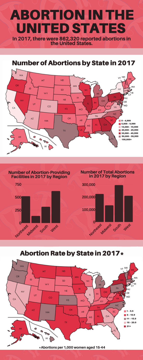
Abortion in the United States
For this assignment I decided to do Abortion. I did this because I believe it is an important topic that … More
2020 Wage Statistics in the U.S.
This week I decided to focus my economics and money infographic on minimum wages in the United States. This then … More
United States Population
For my infographic, I chose to use excel. This is a program I use quite frequently and I like to … More
WaWa locations across the U.S.
Population of Each of the Seven Continents!
To create my infographic, I used Adobe Photoshop. I found a black and white image of the continents off of … More
Coronavirus in the United States
In this infographic I focused on the infamous coronavirus in the United States. Since it has began to spread, it … More
Cases of Coronavirus by Chinese Province
*Editor’s Note: I used Statistica’s “Currently confirmed” case number instead of “Cumulatively confirmed” https://www.statista.com/statistics/1090007/china-confirmed-and-suspected-wuhan-coronavirus-cases-region/ For this map, I decided to … More
