
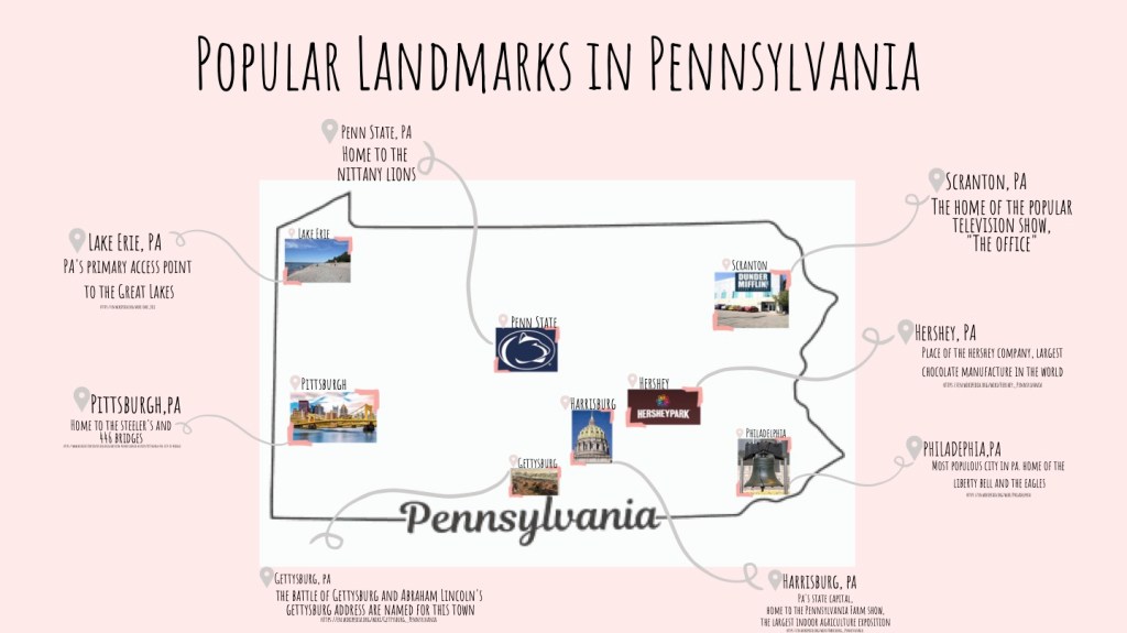
For this map infographic, I once again used Canva. I’ve grown really comfortable with creating infographics from scratch using this site. The research process of this was slightly lengthy, but I was was familiar with all the landmarks that I wanted to use, so that cut my time down a little. I mainly used wikipedia to find facts and pictures about these parts of PA.
I definitely took a different approach with this infographic. I had another one in the works about legal abortion time frames in the US, but I wasn’t liking how it was turning out, so I kept going back and forth between the two.
I decided to use the light pink colors throughout my infographic. I think it’s really pleasing to the eye, and pairs nicely with the font that I chose.
