
I chose this topic because lately I have been really focusing on what I put into my body. It was … More
Category: Infographics
The Great Debate
For this infographic, I wanted to choose something with a lot of statistics. Since the topic of marijuana is so … More
New Graphs: Population vs. Jobs
For this assignment I essentially took the same information from last week and recreated it into two new charts. I … More
Coronavirus Updated and Expanded
For this inforgraphic, I wanted to trace the growth of the coronavirus over time. Unfortunately, most news articles are ‘news’ … More
College Expenditures
For this time around I went with a line graph instead of a bar graph. With some serious research I … More
Books and Their Readers
Let me tell you, this time around these graphs got me FRUSTRATED. I chose to use two different programs from … More
Graphs and Charts: Round Two!
For this assignment, I used Canva and easel.ly. I found this assignment to be a bit harder than the last, … More
Population Statistics of Montoursville, PA
For this assignment, I decided to use the United States Census website to gather data for the 2018 population of … More
Lancaster County Infographic
For this infographic, I used Canva again, because this site has so many different templates to choose from, and also … More
Ocean Pollution: Life Cycle and Where It Is Common
For these infographics, I wanted to utilize my knowledge in multiple programs to create simple yet effective pictures. The first … More
Pennsylvania Statistics
For this assignment, I used the website canva.com. I used it for the first time last week and really enjoyed … More
population vs. jobs
For this assignment I used Microsoft Excel. I did not use a template, I did the assignment from scratch. … More
Marriage and Divorce Rate in Pennsylvania
For this infographic I used Power Point again to create the image. When picking a topic I was looking though … More
US Firearms Infographic
For this infographic, I pretty much started from scratch on canva. I did use a template, but ended up deleting … More
Total Fertility Rate (TFR) in North America
The first thing that popped into my head for this data chart and graphic assignment was babies. I have a … More
Statistics on Social Media Usage
When I first began to think of an idea to research social media came to my mind immediately. I would … More
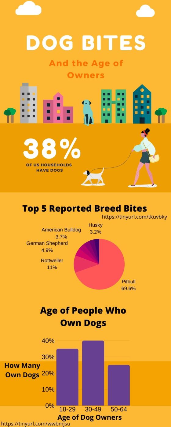
DOGS: Who owns them and who’s biting
When deciding what kind of data I wanted to show, my mind went straight to my favorite thing in the … More
Movies To Top $1Billion Dollars
For the first two graphs and charts I had to create for this class, I stuck with Film and gathered … More
Breakdown of Philadelphia’s Violence Over a Decade
I created my graphs form canva. I used a template that they provided and changed a little things around … More
Video Game Players
I used Adobe Illustrate and Photoshop to complete this assignment. The topic came along from an argument between a friend … More
