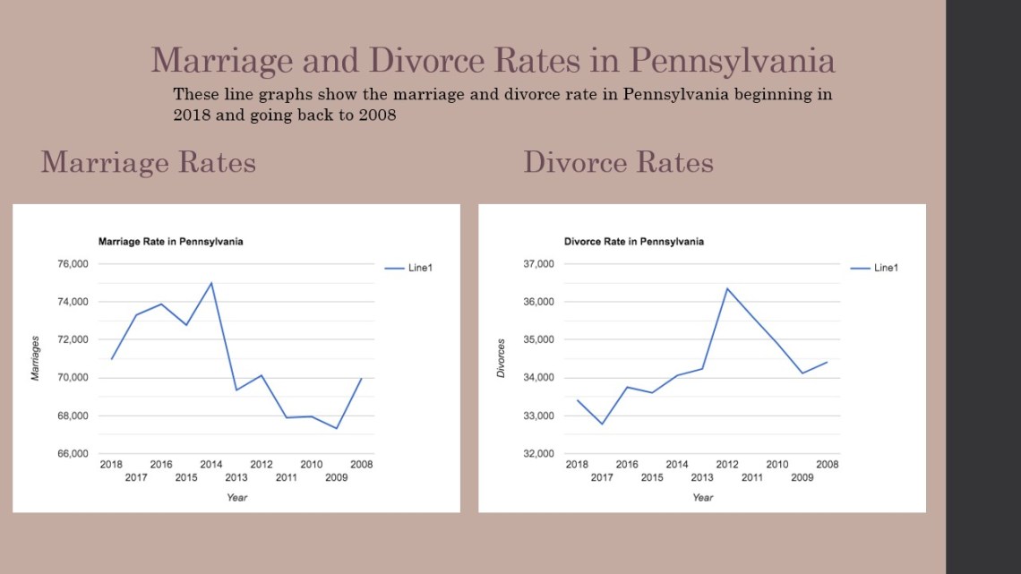
For this infographic I used Power Point again to create the image. When picking a topic I was looking though the links provided on the assignment page and I saw marriage statistics and I though it would be interesting to see the marriage and divorce statistics for Pennsylvania. I charted the information that was provided through Pennsylvania’s Department of Health. The last year that they had data was 2018, I went back and charted the data from 2008.