


Reflection
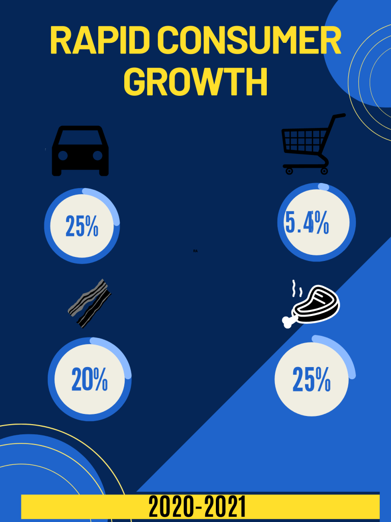
For this weeks assignment I chose to use Canva again for my three infographics on Inflation. I used a templet this time, however I made significant changes to it. The parts of the story that stood out to me the most was the usage of percentages and data. I thought those played a notable role while creating infographic and 3. Prior to this reading I wasn’t very familiar with the ins and the outs of Inflation. I took that perspective into consideration of other readers which led me to create infographic 2. I found the statistics in paragraph 1 very purposeful to the article, but wished it had more details. This led me to create infographic 1 which represented a time line of the rise of inflation in 2021.
It took me about 45 minutes worth of research due to the the majority of my information found in the provided article. I researched outside of the article by referring to an educational blog about inflation. When it came to creating the infographic it took me about a combined 2 hours. Like I mentioned before I used a template for this specific design, but was able to change it up enough to make it my own. I chose the main colors blue and yellow because it deems business professional in my eyes. I also incorporated shapes alongs the edges to add spunk and some edge to gain attention.
