

This infographic would go right after paragraph two. I wasn’t familiar with what exactly China’s zero-tolerance policy was, so I thought it’d be a good idea to make a simple infographic that lays it out. It looks simple, but I think it would be helpful to a reader to give a quick scan of it, to have the knowledge of what exactly this policy is.
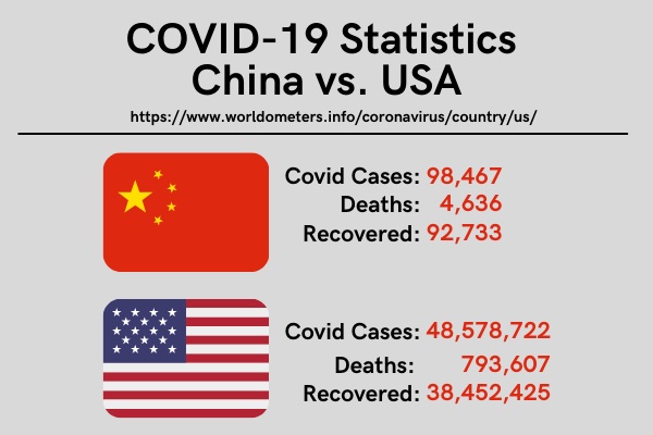
This would go after paragraph 8. I was shocked when I saw the difference in these numbers and felt that it was crucial to put it into an infographic to help the reader really gain a grasp of how high the US’s numbers are compared to China.

This would go after paragraph 11. It was interesting to see how much of the vaccination rates that China has in comparison to the worldwide number. This helps to show that China is successfully vaccinating it’s citizens.
I used Canva to create all these infographics from scratch. There was a lot of information that was very interesting throughout this story. I really wanted to bring to light the numbers throughout it and make it easier for the readers to understand them with the use of infographics.
This whole assignment did take me awhile to complete. There was so much information and research to be done, then creating the infographics on top of it. I’d say it took me roughly 2 hours. I worked on researching throughout the week and jotting down notes in my notebook,then transferring those notes over to Canva when making my infographic.
I kept all the font the same throughout the 3 infographics and tried to keep all the colors pleasing to one another. This assignment was slightly challenging for me, but it really made me have to put all the things that we’ve been learning throughout the weeks together.
