
By: Dyllan Ogurkis
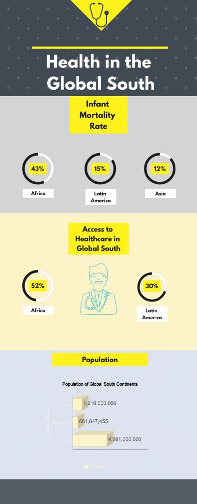
For this infographic, I created this utilizing Visme. In the graphic I used three distinct subsections of Health and Enviorments such as population, infant mortality rate, and rates of access to healthcare. These numbers driven data constituted the majority of the graph. The data was collected from two different locations, the first was Macrotrends and the second was a written work on poverty in the Global South titled “Beyond the North-South divide: The two tales of world poverty”. All in all the entire graphic took around an hour and thirty minutes to research and compile all of the data together.
