
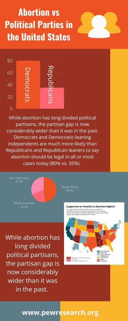
For my politics and elections infographic, I chose the topic of correlation between political party and abortion stances. This topic has been around awhile and the stigma has always caused controversy so I thought it would be a good choice to research. Pew research is one of my favorite sites to look into topics as they provide truthful and widespread information. I used Canva to create my infographic. It is by far one of my favorite online services to create on. My roommate let me try out her purchased version this week, but even with the free version, there are still an abundance of tools. I chose the colors and fonts for this infographic because I wanted it to match the map that I chose to go along with my topic. I wasn’t able to change the colors on it so I altered my infographic to match. As for the font I wanted it to be sparingly and basic because of the complex background I put together. I wanted it to be eye-catching so people would be drawn in to read the graph, charts, and map. Researching this topic wasn’t hard as Pew Research is easy to navigate and find what you need. Creating the infographic is what took me the majority of the time this week. This is probably my favorite infographic I have made so far.
