
For this week’s infographic, I chose to use Canva again since I have become more and more familiar with the program and it has your basic infographic dimensions. This was the first time where I did not use a template and created my own infographic from scratch while using Canva, I found it quite difficult adding different elements such as pictures, text boxes, and graphics.
I researched this topic using reputable sources such as The CDC and the National Institute of Diabetes and Digestive and Kidney Disease. I knew that these sources would have the best information about obesity considering I did not know much about this topic. It took about an hour to conduct my research since I wasn’t sure what exactly I wanted to include on my infographic. The overall creation of the infographic itself took about two hours since I was messing around with different elements on Canva.
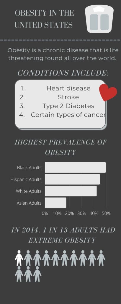
I wanted to keep my design process simple and to the point. I wanted to include a different chart this time around so I added the little figures since the statistic is based around people. The colors and fonts were actually chosen for me. I found a new element in Canva which is labeled as “Style”. There are a bunch of color schemes and fonts that complement each other.
References:
The CDC – https://bit.ly/3vZGGHH
National Institute of Diabetes and Digestive and Kidney Diseases – https://bit.ly/3jRWcAx
