
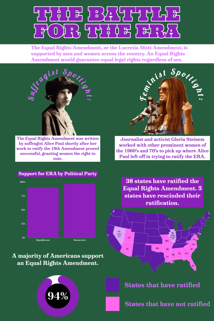
This week I did my infographic on the ERA. I made this infographic with Adobe Spark and Canva and it took me roughly three hours. There was a lot of information I could have included and pictures I specifically wanted to put but I didn’t want it to look too cluttered. This week I used a map, two images, two textboxes, and two charts.
It did not take me too long to research the topic because I learned about this recently in another class but I had to find the statistics for the charts which took me about 20 minutes. The design process took me significantly, 2 hours and 40 minutes, longer than the research because I had to make the charts and space everything out. I’m always indecisive about where the graphics are placed in relation to one another. I chose these colors because these are the suffragette colors, and have specific meanings. These colors are still used today by the Alice Paul Institute and the National Organization for Women.
Sources:
