
Reflection
After my attempt last week with using powerpoint and photoshop, I decided to go back to Canva for creating this infographic. I started this infographic from start. I enjoy this program because of how much it offers and its simplicity. Canva works extremely well with my style, especially compared to powerpoint and photoshop. There really isn’t anything I dislike about this program.
I researched this topic on google and by making sure I was looking at notable and reliable sites. It took me about an forty-five minutes to an hour to research this topic. I had to use more sources than usual due to the broadness of my topic and the different paths I took with it. When it came to the infographic, it took me about two hours to make.
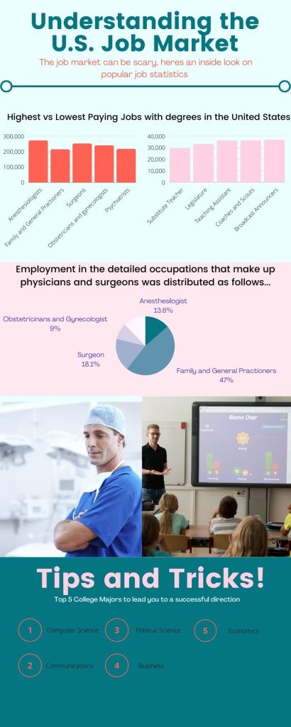
My design process started off with selecting pleasing colors. I chose blues, pinks and oranges because I felt they were neutral and subtle colors. I thought it was important to incorporate some type of picture so I chose a photo of a doctor and a teacher because of their significance to the graph above. I also thought it was important to organize my infographic in 3 sections to keep it looking structured.
References
U.S. Bureau of Labor Statistics
