
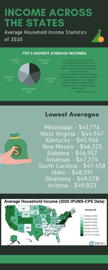
Average Household Income Statistics of 2020
For this infographic, I picked the topic of household income across the U.S. I wanted to focus on the highs and lows of incomes as I highlighted them with a pie graph and list format. I wanted to reach all over the country so I found a graph from the United States Census Bureau’s Annual ASEC survey. The program I used to create this was Canva. It’s always my go-to and it has the tools I need to make my ideas come to life. I started from scratch with this project as I wanted to make it my own. I picked the fonts as they were bold and eye catching. The color palette I went with was greens because of, well, money! That’s the topic so I felt that it was perfect! I researched this topic using two websites : https://tinyurl.com/k63k9sy2 and https://tinyurl.com/98937dv2 . These two websites made it easy to find the information I needed to put this project together. Creating the infographic did not take me long once I found my information because Canva is easy to navigate and I had my idea previously thought out.
