
By: Teresa Nappo
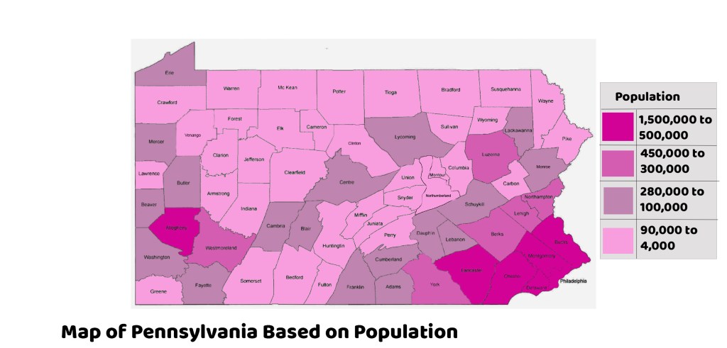
For this week’s map infographic, I decided to complete my topic on population in each Pennsylvania county. I used the program Photoshop to complete this project which I have not used thus far in this course. I have only used Photoshop a handful of times for other classes so it was a bit of a challenge since I have not used this program recently. The Pennsylvania map is a template that I found on the Internet and colored the counties in by using the paint bucket tool in Photoshop. I did not like using this program because I found some counties to be a pain when it came to the paint bucket tool. Counties such as Venango and Clinton were not cooperating in this area, but it was probably the map that I used.
I knew that Philadelphia County and Allegheny County were some of the most populous counties in Pennsylvania since they revolve around two major cities. Everything else I was pretty unsure about, but the research was not too extensive. The overall research probably took about 10 minutes since each population can be found on the website World Population Review. Then the map itself took about two and a half hours since I had a problem with filling in some of the counties.
My design process was pretty simple and to the point. The map was already a template so I kept the font choices the same for that. I wanted my font to stick out for the title and legend so I used a thick and bold font to capture the viewers attention. Lastly, I decided to use different shades of pink/purple since these colors really stand out and I liked that Dr. Dennis used these shades in his lecture.
References
Pennsylvania Map- https://bit.ly/3FyaeAQ
Pennsylvania Populations- https://bit.ly/3mEcUEi
