
By: Dyllan Ogurkis
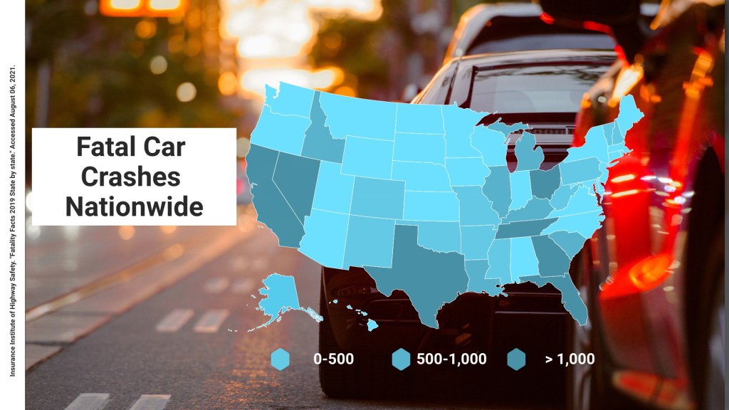
For this infographic I utilized the program Visme to create the map infographic. The data within the map is from the Insurance Institute of Highway Safety. The total design and research process took about 90 minutes from start to finish. The template was originally utilized by Visme to convey COVID statistics but after inputing my own statistics into the map tool, I was able to revamp the design into my own project. Overall the entire process was without many hiccups and a relatively easy compilation while utilizing the program Visme.
