
For this infographic I used Canva to create it. I used Canva for the first time last assignment, enjoyed it and wanted to get more familiar with it. I created this from scratch so that I could really practice with what the site offers. It took me about 20 minutes to research, and about an hour and a half to make since I was playing around with all the tools and different graphs it had to choose from.
Initially, I wanted to do a general infographic about social media use in the U.S.. However, I found that focusing on one piece of social media was easier to find statistics for that could be broken down into graphs. I got all of my information from https://www.statista.com/
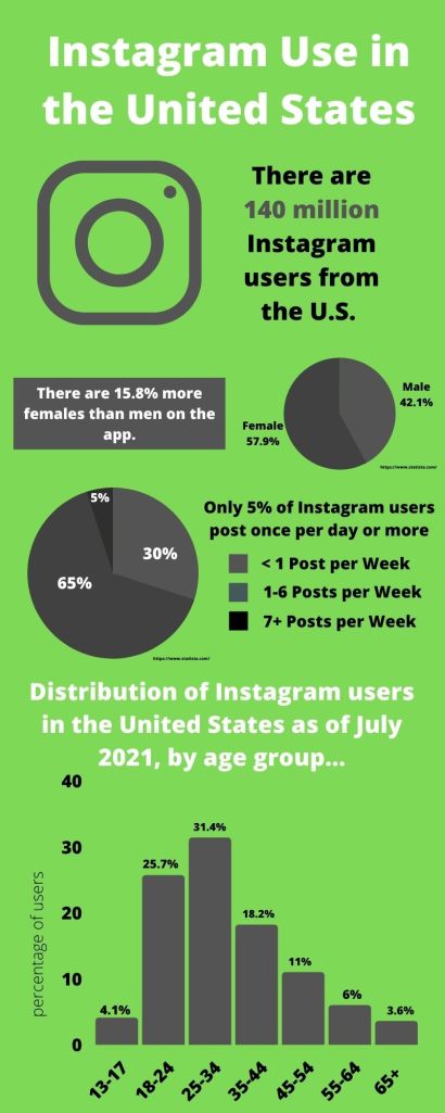
I chose the design I did because I was looking to make something that looks fun, but not too overwhelming to look at. I think the green and purple compliments each other. I chose the font I did because I wanted to make sure it could be easily read and seen. I chose to use 2 pie graphs because I wanted to include multiple facts to make up for space that needed to be filled, and they allowed for the space comfortably. I chose to use a bar graph to display the information on the bottom because of the amount of data it contained.
Resources: Statista
