
The template that I used to create this infographic was Canva. I’ve only used Canva once before. I used it for my first infographic. It was kind of hard to find charts on Canva, but once I found them, I played around with them and figured out how to use them. I used a template because I thought it would be hard to make a chart from scratch. I couldn’t find charts in Canva from the webpage, so I had to search for Canva charts on Google, and it came up right away!
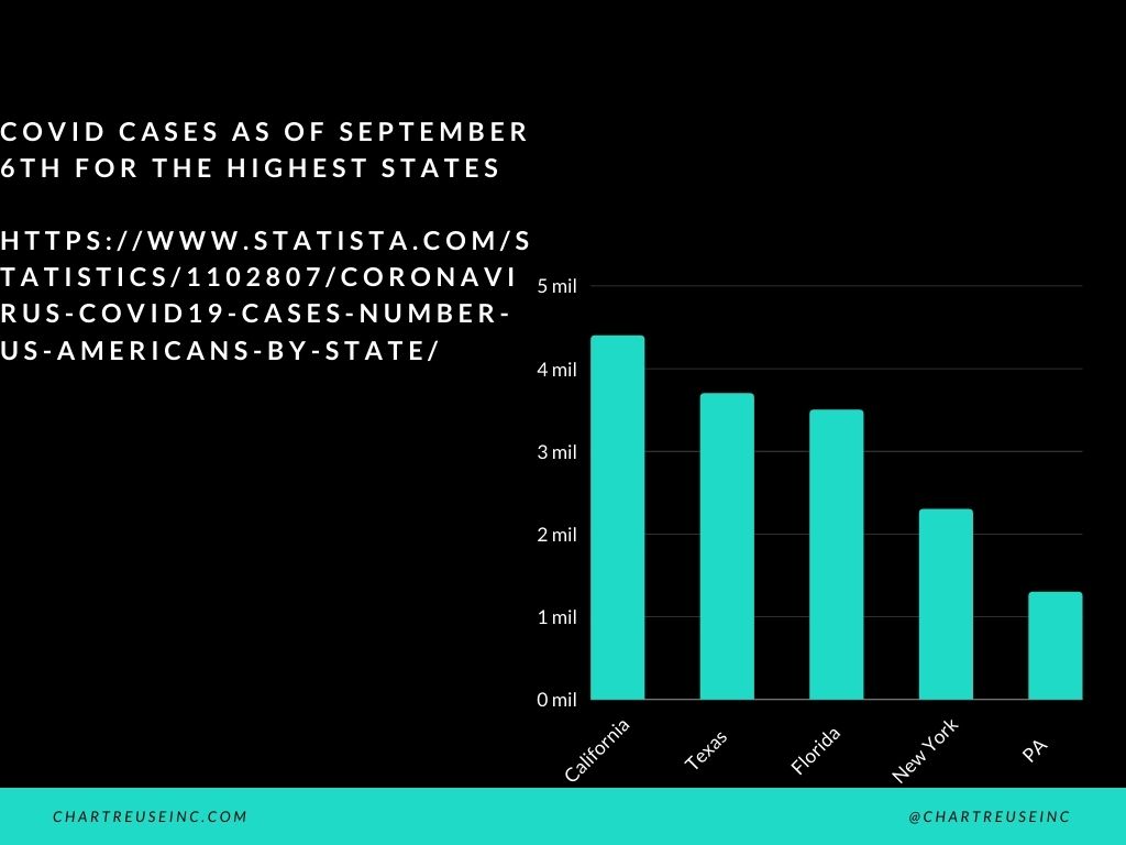
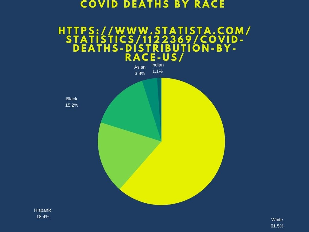
I researched my topic, by looking online at Covid cases. It took me about 15 minutes to search Covid cases and the right information that I wanted. The reason why it took 15 minutes, was because there is a lot of sites with information about covid-19. It took me about 10 minutes in total to create the two graphs.
For the first graph, I decided to use a black background with white bars. I didn’t know how to change the bar colors, so I played around with the background and thought the other colors didn’t look good with the white bars, so I chose black. For the second graph, I chose the yellow chart on a purple background. I thought the bright yellow pie chart would look good on the purple background. I thought light blue, or red on purple background looks too weird.
