
By: Ava Stasen
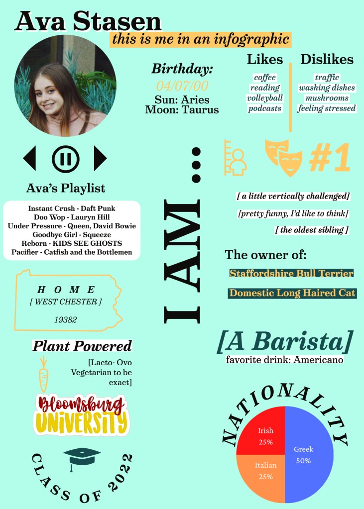
I used Adobe Spark and Powerpoint to make this infographic. I used a custom template on Adobe and made the pie chart on Powerpoint. I enjoy both of these programs and find that they are easy to use but Adobe Spark can get glitchy sometimes. I tried to use Excel but did not have success making a pie chart.
I chose myself for this project so that I could focus on the graphics and less on the information; I don’t have to research myself. It took me longer than it probably should have to create this infographic (4 hours), but I had some trial and errors with spacing, colors and template size.
I chose the green background because I’m really enjoying light greens right now. I chose the orange, dark green and black text because I thought that they were complimentary. I used curved, titled and bracketed text to create a sense of separation and flow between each fact. The curved text is meant to keep the eye circulating around the infographic and the bracketed text is meant to give the viewer a place to “rest”; it’s contained and simple. I wanted to take some chances creatively as well with the use of icons, no columns, minimal text and complimentary but aesthetic fonts.
I definitely leaned into the graphic in infographic!
