
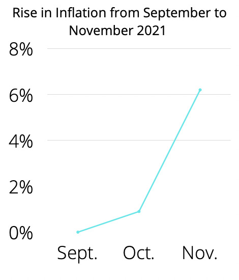
This infographic would be inserted with paragraph 1. I made this infographic as it displays the immense gain inflation saw in October.
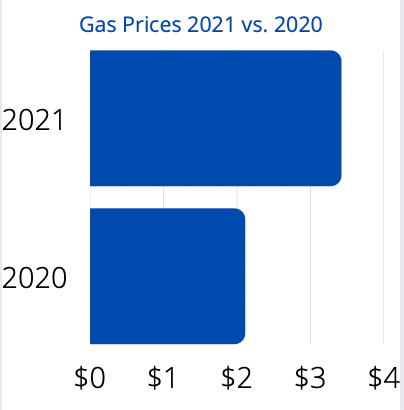
This infographic would be placed alongside paragraph 15. This is meant to show the difference between gas prices in October 2020 and October 2021.

This infographic goes with paragraph 9. The paragraph in the story comes from Wells Fargo, and so does the information in the infographic!
I made each of these infographics for this story on Canva.com. The information was all from the source article, except for he Countering Inflation one in paragraph 9. I took that information from Wells Fargo’s website and boiled it down to those two sentences. None of these took too long to create, as I had all of the information very available to me.
I chose this story because it seemed the most interesting to me. None of the other articles available to choose from really intrigued me as this one did.
