Shiba Inu passes Dogecoin as top “dog” in cryptocurrency- Infographic Support 1

This Infographic is used to compare Shiba and Dogecoin. I would place this alongside paragraph 1. This was made in powerpoint, which allowed me to easily compare the two cryptocurrencies side by side.
This infographic illustrates the 900% jump Shiba experienced as described in paragraph 3. I made this paragraph on Canva, using their graph making system, and adding in my own labels to further describe what is happening.
This infographic, also created on Canva, is illustrating the huge jump Shiba made as described in paragraph 7.

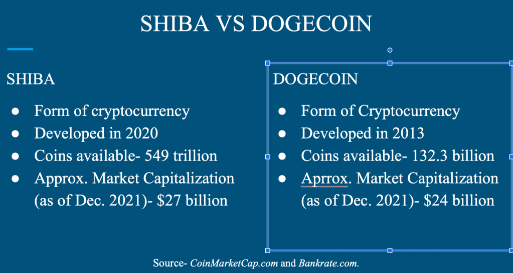
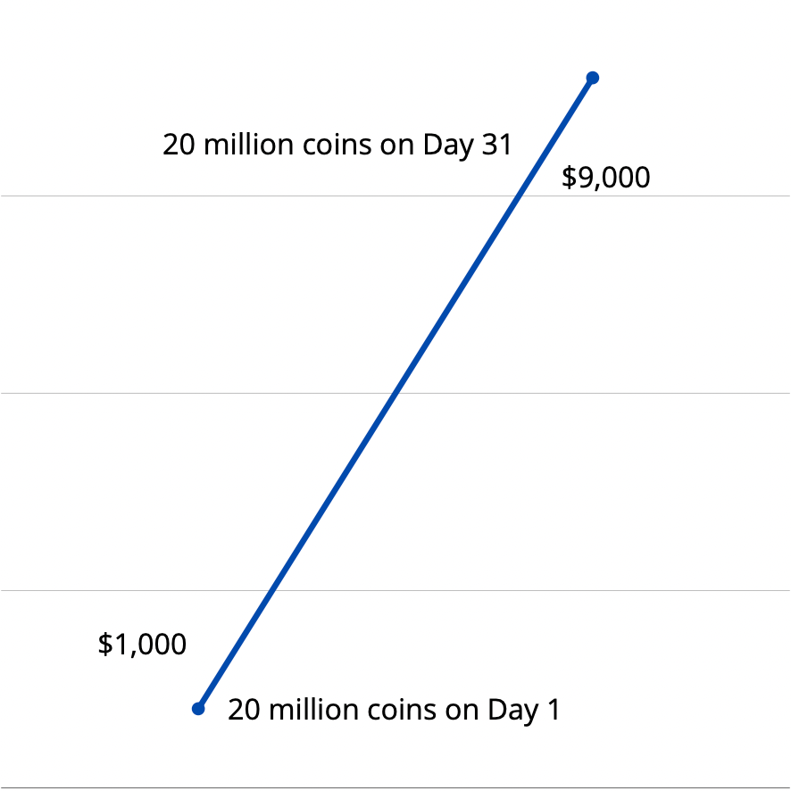
The only infographic I truly had to look outside of the story for information was the first one I made. For this I googled how Shiba and Dogecoin compared to each other. I took the information I found on Bankrate.com and compiled it into one side-by-side slide. The other two, however, came from information found within the article.

As I said above, I made the first infographic in Powerpoint and the other two on Canva. After a semester of practice, making these were extremely easy to make. Once I finished making the graphics, I simply screens hotted the results to use for the assignment.

Leave a comment