

- What program did you use to create your infographics? Did you use a template or start from scratch? What did you like or dislike about this program?
I used Canva for my infographics this week as I always do. I used a template for my first one but deleted a lot do the pictures and stuff it had and I then began to change all of the colors from blues to red, yellow, and a grey color for it. The other two infographics I started from scratch. I like this program because you can make it your own even if you chose from a template you can mess with all the fonts, font sizes, colors, and pictures on it.
- What elements of the story caught your attention? Which points of the story did you think could be enhanced by the infographic?
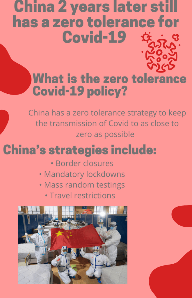
I chose this story to do my infographics on because Covid has impacted all of our lives over the past almost two years and I wanted to know more about it and how it has affected China and how they have managed to deal with it in their country vs ours. I feel like adding my infographics onto the story would give people more so a visual of the diagrams and charts I made so they can clearly see how China’s policy has worked for them since the outbreak of Covid back at the end of 2019.
- How did you research this topic?
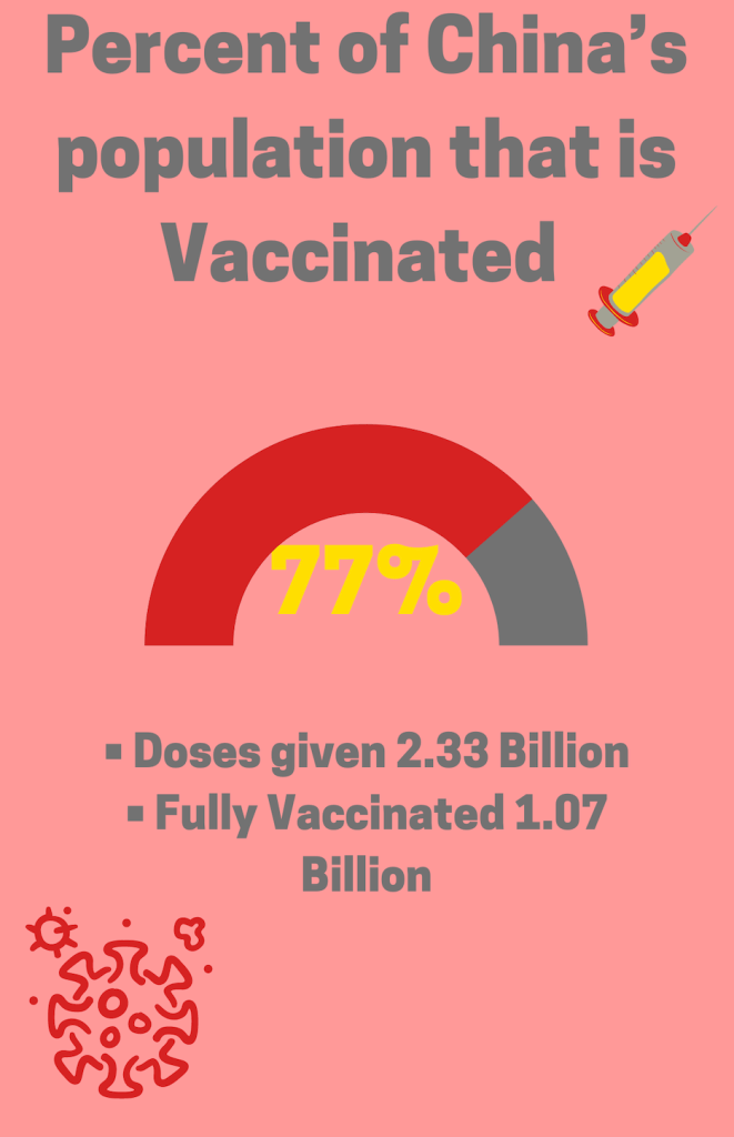
I research this topic by googling more statistics on the different countries’ Covid numbers vs China’s and I got to see the different kinds of rates and how it affected us vs the rest of the countries. The other three countries I compared were Brazil, India, and the USA. I then found the reliable sources I knew I could count on and trust to use their information on my infographic.
- How long did it take you to research and then create the infographics?
I would say this took me about 45 minutes to research to make sure I gathered the correct information. The infographics took me about an hour because I wanted to make sure it looked appealing and changing the colors and fonts and adding pictures tastes a long time when you put effort and creativity into it.
- What was your design process like? Walk us through why you made the color choices, font choices, and layout choices you did.
For my design process like I said before, I began to use a template but I changed all the colors from different blues to then making it a red and adding yellow and grey. I chose red and yellow as my primary colors because China’s flag is red with yellow stars on it. I then chose a font that stood out to me for the headings on each infographic and used a bold font on it along with the dark grey I chose for it. I like the graphics you can add like photos because even if it doesn’t match your color scheme you can change the colors on it to make it match. I did this with multiple graphics I chose I added them to my infographic and then made it my own an to match the color scheme. My layout was pretty simple as well I had headings at the top of each page and then smaller headings for the body paragraphs of information. I chose the same font throughout the three infographics.
