


For this weeks infographic assignment, I chose to create my graphics around the “As many try living with virus, China keeps up zero tolerance” article. I thought this article was the most interesting out of the 4, and when reading the sections I made graphics for stuck out to me specifically; I felt they needed more elaboration. I created all my graphics through Canva. I chose the colors I did because they worked in usion with the country emblem featured on the second infographic (it was created first, so I just followed the pattern afterward). I chose the font I did because I felt it looked most professional.
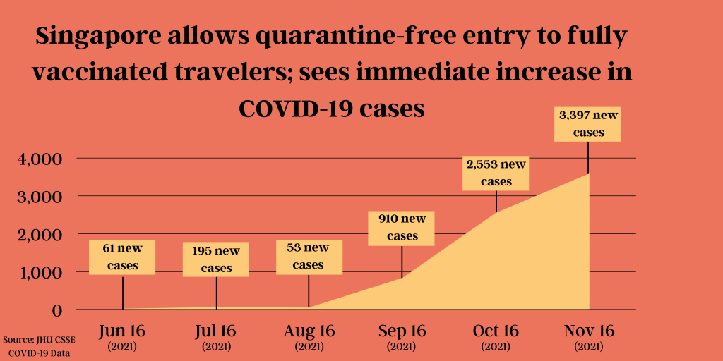
For my first infographic, all my material was found from JHU CSSE COVID-19 Data. It took me about 10 minutes to research, and about 30 minutes to make this graphic. I chose to make this graphic because I felt the information they were conveying in that section could be visually communicated.
For my second infographic, I didn’t use any specific source. I googled what zero-tolerance meant in terms of COVID-19 protocol and various things came up, so the information displayed is my summarized version of what I learned on multiple different sources, saying essentially the same thing. It took me about 10 minutes to research and 20 minutes to make. I felt this graphic could be beneficial to the article because some places never experienced a full lockdown, let alone a zero-tolerance policy approach so they might not know what that means.
For my third infographic, all of my material was found from Our World in Data. It took me about 10 minutes to research, and about 20 minutes to create this graphic. I chose to make this graphic because that specific section said they would open when the country had 85% of people vaccinated, but didn’t say how many are currently vaccinated.
Sources: https://ourworldindata.org/covid-vaccinations?country=CHN , https://github.com/CSSEGISandData/COVID-19
