

This infographic would go after paragraph 0 or after paragraph 1. It could also go after paragraph 11. I think it can be confusing or unknown to the average person how a case makes it to the Supreme Court and why. I made this one to give a brief description of what the Supreme Court is as well. This should provide additional information on how the court “takes up challenges to a Texas law”.

This infographic would go after paragraph 3. This expands on Kavanaugh’s loophole statement, states his past rulings pertaining to abortion, some facts about him and his career, and the controversy that plagued his appointment. It felt crucial to add the controversy because I believe it is adjacently related to women’s rights.
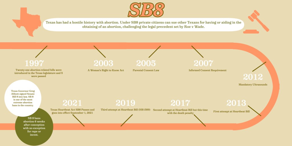
This infographic could go after paragraph 12 or 13. It is made to explain (simply) what SB8, or Texas’ abortion law is, and how it came to be. Texas has had a hostile history with abortion and SB8 has been the end goal of conservative legislators for some time.
I made these infographics with Adobe Spark because I can always guarantee I can make an infographic there that is acceptable. Designing these three infographics took about 4 hours to complete as I had some difficulties along the way. Research for this project took longer than previous ones at about 2 hours. I spent a large amount of time researching Kavanaugh’s past rulings and the history of Texas’ abortion law.
I chose a flowchart for the Supreme Court infographic so it would be based on graphics as opposed to text and would be easy to follow. I chose a primarily text-based graphic for Kavananaguh because I wanted to highlight his quote and past rulings as they will likely continue to be important and notable.
These three elements of the story caught my attention because I thought they had the ability to be expanded on in creative ways. I knew I wanted to incorporate one timeline infographic and saw I could through visualizing attempted and passed legislation.
I chose the color palette because I figured most people would use USA colors. I’ve done a USA-colored one and didn’t enjoy it aesthetically so I wanted more neutral but complementary colors. I always try to use a font that is readable but not familiar ( not a Microsoft font). I like to back the text in a rectangle because I think it makes it stand out and adds depth to the infographic.
Sources:
