


I once again used Canva to complete this week’s infographic story. I started from scratch again since I have gotten used to this program and know where everything is. I really enjoy the little graphics that I am able to insert on each infographic it makes the overall look feel professional and very well put together. There is one downside, I find it hard to center each text box and line each one up perfectly since this is such a tedious program.
This story really caught my eye, I didn’t even know that we were still under tight restrictions until recently. I thought travel pretty much went back to normal months ago, so you learn something new every day. I honestly had no idea that we reopened traveling to 33 countries which I thought was very interesting and wanted to highlight that in one of my infographics.
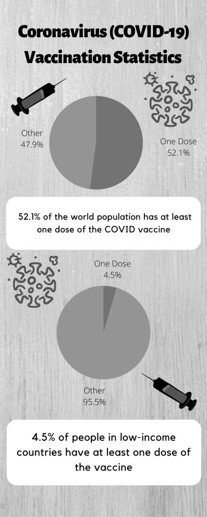
My research took about an hour to complete since I really read into the article provided and even looked up more online on the Associated Press. My sources that I gathered information on include the Associated Press, Our World in Data, and Association of Performing Arts Professionals (APAP). The overall creation of my three infographics took around two hours since I wasn’t sure how I wanted to present my information and what I wanted the layout to look like. So in total the whole assignment took about three hours to complete.
As far as my design process, I decided to stick with what I have been doing which is selecting a patterned background and choosing a color scheme Canva provides. I also did the same thing for the font, I found two fonts that are already generated on the program and used it on the infographic. After this, I found graphics on Canva that supported my information and added them onto each infographic.
References:
Our World in Data: https://bit.ly/3qGDyQA
APAP: https://bit.ly/3oyoOQR
