
This would be inserted in section 6.


Left Image would be inserted between sections 9 and 10 while the second image would be placed in section 5.
By: Dyllan Ogurkis
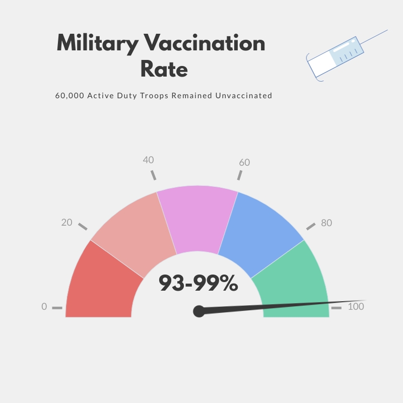
For this infographic, I created the three separate graphics in Visme. All three deal with the vaccination rate as well as repercussions that could be faced by soldiers who continue to remain unvaccinated without approved exemptions. The entire folder of infographics took around 2 and a half hours to organize together. I wanted to keep visual effects a main point for these infographics, with that in mind I utilized many different graphics and images both revolving around COVID as well as graphics to symbolize the repercussions that could face unvaccinated soldiers. For the graphs, I varied from tradition pie charts and utilized a variation of them to symbolize the total rate of vaccination as well as a comparison chart with rates for both the military and the civilian population in the United States. for this supplemental data, this was obtained from the Mayo Clinic.
