
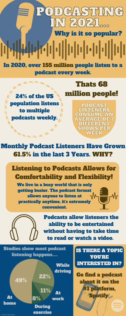
For this week’s topic of Media and Entertainment, I chose to focus on podcasts. I chose to focus on this topic specifically because I love podcasts. I listen to podcasts more than I watch TV or listen to the radio. It’s perfect for being on the go which I always feel like I am, so when I heard media I immediately thought: podcasting.
For this infographic, I used Canva to create it. I started from a blank template, which I usually prefer because it allows for more creativity with what I specifically want. I chose the blue, yellow, and brown colors because I felt they all worked best together. The only downfall when using Canva for this specific infographic was the fact that I cant choose each color of my pie graph. I would’ve preferred to use the same color scheme on my pie graph that I used for the whole infographic. I chose a font that I felt was bold and legible, because my infographic contains more words than graphics so I wanted it to be easy to see. All of my information was found from Brandastic. It took about 15 minutes to research and an hour and a half to create.
References: https://brandastic.com/blog/why-are-podcasts-so-popular/
