
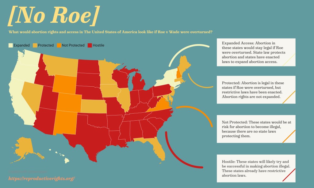
For this assignment I chose to do something different than a choropleth map. I liked the way the way the human trafficking map used a color code for qualitative information.
Maps containing abortion per capita data already exist and I thought that I was doing something very original by doing a map on something that hadn’t happened yet (Roe has not been overturned so abortion is legal in all of these states), but when I went to research state’s abortion laws, I saw that the Center of Reproductive Rights already had an interactive map with all of the data. I decided to try to make that map again incorporated with an infographic and using a scale of color rather than random ones.
It took me only a half hour to research the information because I found it all in one spot but it took about an hour to design the infographic. I used datawrapper to make the map because it allowed me to put in values that weren’t numbers and allowed me to pick the colors. I used red for “hostile” and then used lighter shades in a complementary palette to convey restrictiveness. I decided to explain each color because on their own they do not provide enough context. I made the rest of the infographic (background, heading, subheading, textboxes) in Adobe Spark. I used curved lines instead of straight ones to create a movement around the graphic.
