
PROGRAM
To make my infographics, I used Canva. Canva is an easy site to use because of the number of templates and user-friendly tools. I was able to quickly and efficiently create a pie chart and bar chart in good time. This site is the best for beginners and anyone who wants to make their ideas come to life in a quick and free manner. I used this site during my internship and for my first infographic in this class.
RESEARCH
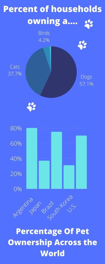
For this infographic, I researched pet statistics. I used statistics that came from the United States for my pie graph and from all over the country pertaining to the percentage of pet owners in general. My pie graph focused on the percentage of people in the U.S. owning a dog, cat, horse, or bird. The bar graph was centered around 5 countries percentages, each dealing with the country’s overall pet total.
DESIGN PROCESS
My design process consisted of me using a Canva template. The pie graph and bar chart was easy to create and alter due to Canva being super user friendly. I chose to keep my infographic on a basic level rather than making it overfilled. The colors and font was easy to read and made the important information stand out so I thought it was a good fit.
Sources
https://www.avma.org/resources-tools/reports-statistics/us-pet-ownership-statistics
