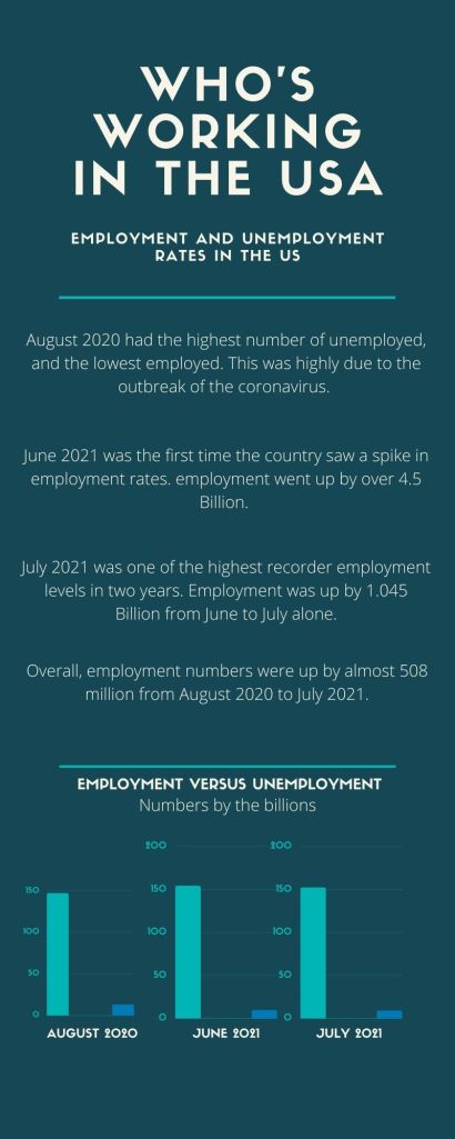
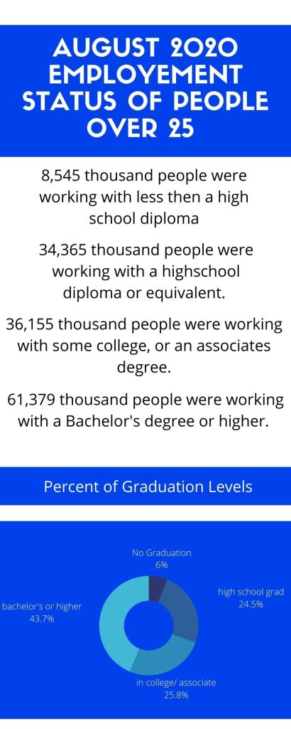
For this project I branched out and used CANVA. This was new to me but I used a template for both to help a little. I liked how used friendly the site was, however I felt almost bad deleting so much from the original outline given to me. For this project I did my research through one of the government sites suggested to us in the notes this week. To make both info graphs, along with the research. It took me a little over two hours to complete. For my design I didn’t want to go to crazy due to this being my first time on this site. However, I did try to use the same font and color choice of blue in both to give them some similarities. I also tries to stick with the layout of header, then information, then graphs at bottom, cause I felt they looked the most organized that way. I also picked the font choice I did because I felt it gave the project a clean look.
A space for BU students to showcase their work


