

Program
For these infographics, I used Canva. I used Canva for my last infographic so this was my second time using this website. Canva makes it really easy to create graphs and charts because there are many templates to choose from. Since I’m still getting used to create these infographics, there are still some things I could improve on. I wish that my bar graph had more numbers but I wasn’t sure how to add more.
Research
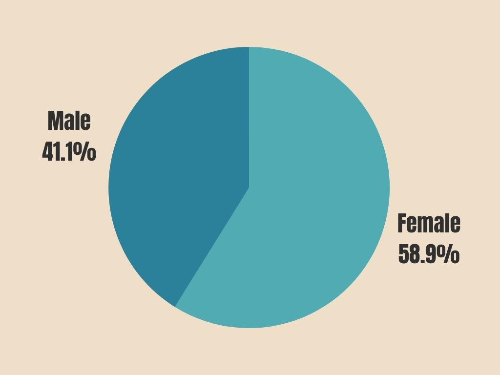
I researched this topic just by searching on Google for different statistics. I was honestly surprised how much information that I found and how fast I found it. It took me about 20 minutes to research the topic and decide what I wanted to include in my charts. From there, it took me about 30 minutes to create my charts. Once I picked a chart layout and a color scheme all there is to do is to input your numbers and Canva creates the graph for you. The research was interesting for me because I had no idea the statistics of the students at Bloomsburg University.
Design process
My design process goal was to make it as simple as possible especially since it is my first time making a chart infographic on Canva. I chose one of the premade color schemes that are offered on Canva that wouldn’t be too distracting and colorful. Also, I tried to keep the fonts as simple as possible and just did black text so it would stand out against the light tan background.
