

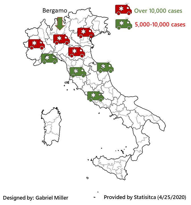

I started by looking for the most number/data intensive paragraphs, looking for the least comprehensible information. My first infographic tackled the higher number of cases in the country, with Bergamo highlighted by the arrow. I used ambulances to represent the number of cases. Originally, I started with green for the higher amount of “over 10,000,” but realized red worked better at highlighting the severity of the issue. I chose these colors because they are the colors of the Italian flag and I thought they work well.
The second infographic I did focused on the amount of cases they counted, compared to their estimates. It turns out, the estimated amounts are much higher than actual cases, and this infographic shows that dramatically. I don’t know if they have revised their estimates to match the data or if the cases are lower, but what the article reported is quite astounding as the bar chart shows.
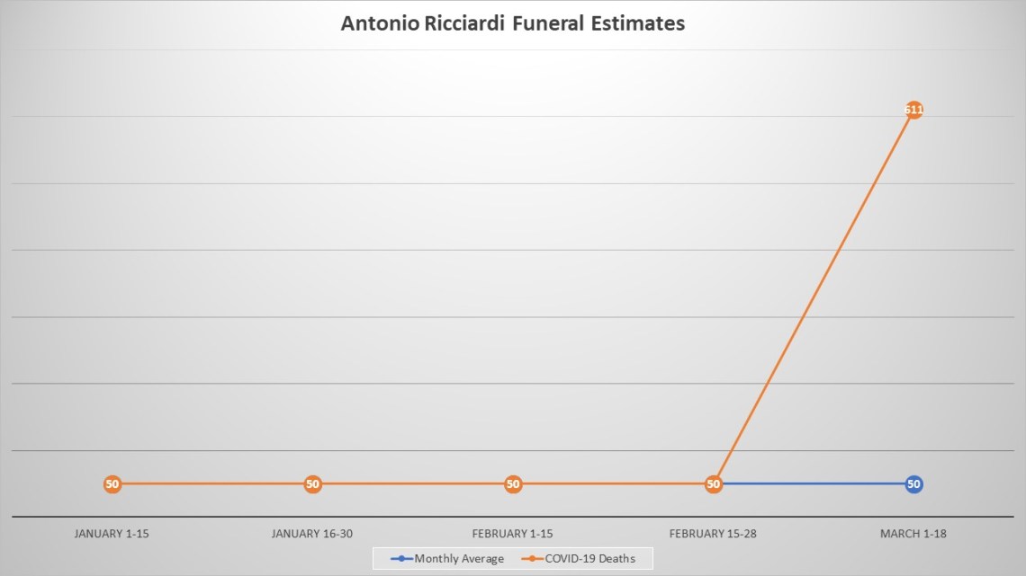
The third one is depicts the dramatic leap in the number of funerals the funeral director reported to have. There were no official numbers of previous years, so I just went with the estimates. I don’t this one I did.
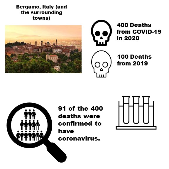
My fourth infographic shows the city of Bergamo and its death toll. I tried to use more visuals to exemplify the complex elements being described. Basically, it shows a group of what is supposed to represent 91 people tested positive for COVID-19 and 400 died as of the reporting, which is up from the yearly average of 100.
