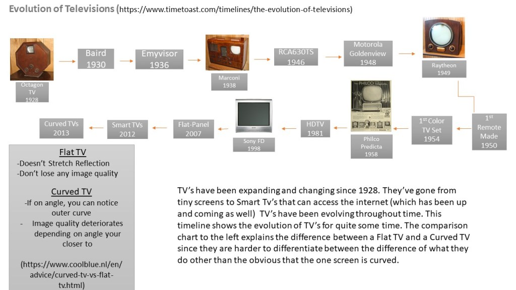
Creating this infographic took a lot of time. I used PowerPoint this time because I wanted a bigger slate since my timeline has 17 points. I added the boxes and arrows on my timeline. This was a topic that i felt was interesting to cover with media since TV is a huge part of media. I tried to pick colors that contrasted with one another and that weren’t flashy. I didn’t want to take away from the actual content. Researching this topic took over a hour and creating the graphic took me around two hours. I found PowerPoint easy to use for this topic. Overall, I did like using PowerPoint and I tried to make the right choices based the topicc.
A space for BU students to showcase their work

