
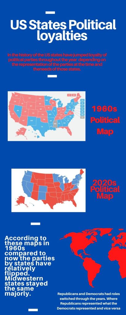
This infographic was not very difficult to make. It took more to find what to do on the topic than to actually create the infographic itself. I researched the topic by looking up the states, and the major differences in year past. I ended up finding that the current states political status have changed compared to previous years and elections. In designing this I made sure to keep the colors associated by. the parties and the Us to keep it ‘American” looking. I placed the two maps to show the differences in the two decades that have been 60 years separated.
