
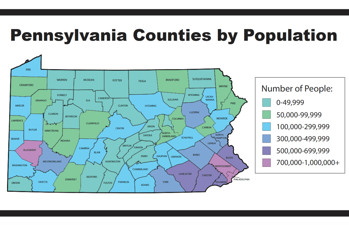
For this infographic, I used Adobe Photoshop and Adobe Illustrator. I used a blank map of Pennsylvania from Google that is labeled for noncommercial reuse with modification. I went in and filled the colors in based on the key I created on Photoshop, then I labeled each county in Illustrator. I also made the key in Illustrator. This took around an hour to create.
For my research, I used this website that took the information from the US Census website and put it into a nice chart. This made it so much easier to go through and assign colors to counties.
