
I used Canva again to make this infographic. I used another template to start my infographic but I changed the color scheme and moved around some of the blocks. The reason why I changed the color scheme to blue is because that is the color for JDRF which is a diabetes organization. Blue is one of the colors for diabetes.
I had an easy time researching this topic. The three websites I used are websites I use all the time to get information for diabetes. The websites are JDRF, ADA (American Diabetes Association), and Beyond Type 1.
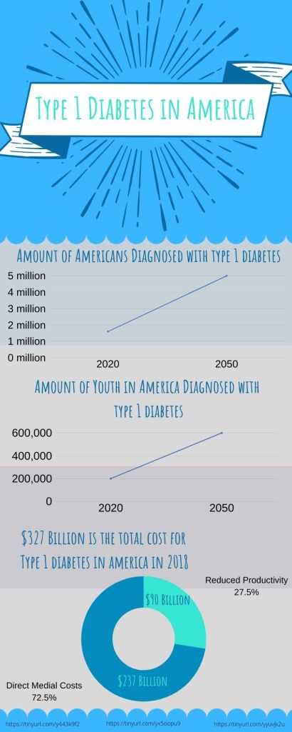
For this infographic, I chose to make it more simple and basic so that the focus is more on the information in the infographic. I know that the design of infographics allow more people to be attracted to it but I do not want people to be distracted by my little graphic images on the infographic and focus on the graphs and charts.
