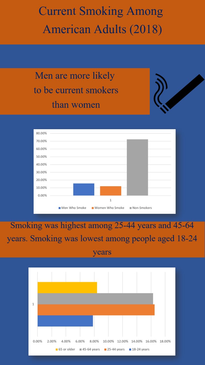
This week I did my infographic on the smoking rates in America. I thought this would be an interesting topic because the rise of the Juul and other devices that promote a new way of smoking. I used power point to make this infographic and I got the information for the graphs from the official website for the CDC (https://www.cdc.gov). I chose these colors just cause I thought they looked well together blue, orange, and dark blue. I added more text to this graph than the last one to try to help explain the graphs.