

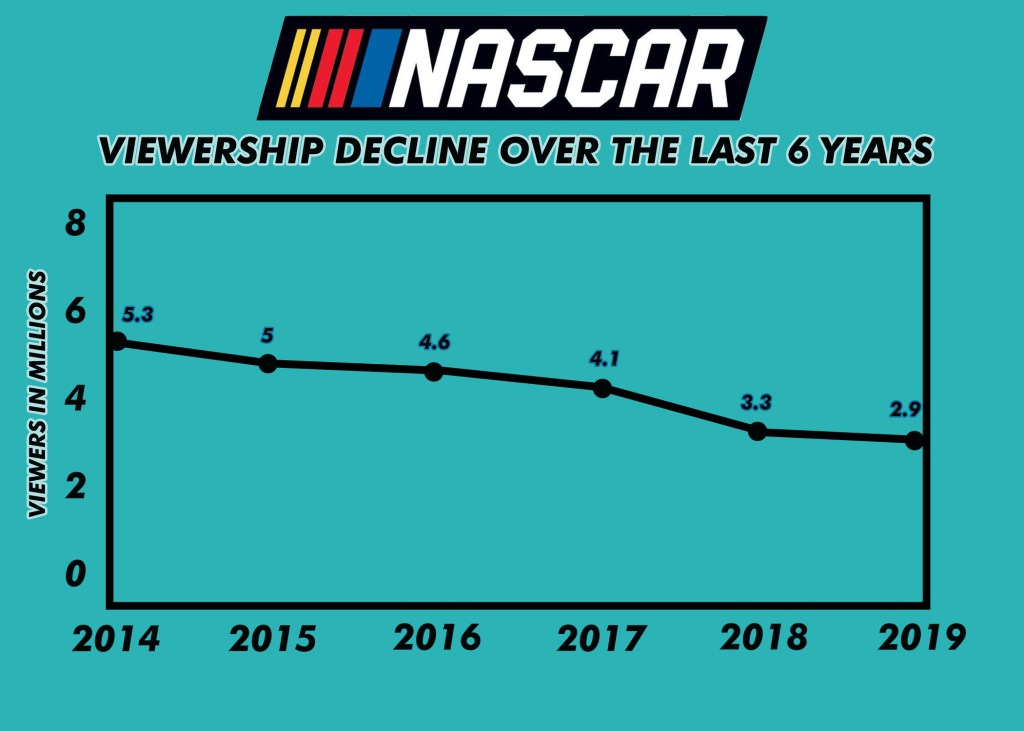
The topic I chose for this weeks charts and graphs 2 was the sport of NASCAR. Often overlooked, this sport has a very interesting history and involved fanbase, but viewership has recently been plummeting over the last few years. I took this opportunity to create a line graph describing the TV viewership falloff over the last 6 years. I did not use a template for this and brought both images up from scratch on Photoshop. I collected the data from the best drivers of all time from bleacher report, and found the viewership statistics from Forbes.com. Per usual, the most time consuming aspect of this weeks project was figuring out the color scheme and font I wanted to use, as well as creating the table from scratch. I went to a few different websites to look for templates but was not satisfied with the result as it looked very unprofessional and bland, so I took to creating both charts from the ground up which also helps with the correlation between the two charts. I am beginning to learn a few new tricks in photoshop now due to these charts and graphs which is nice, as I often watch a tutorial when I am stumbled on how to create something. Overall I am pleased with my work and think it fits the aesthetic of NASCAR as a sport with the colors, fonts, and information used.
