
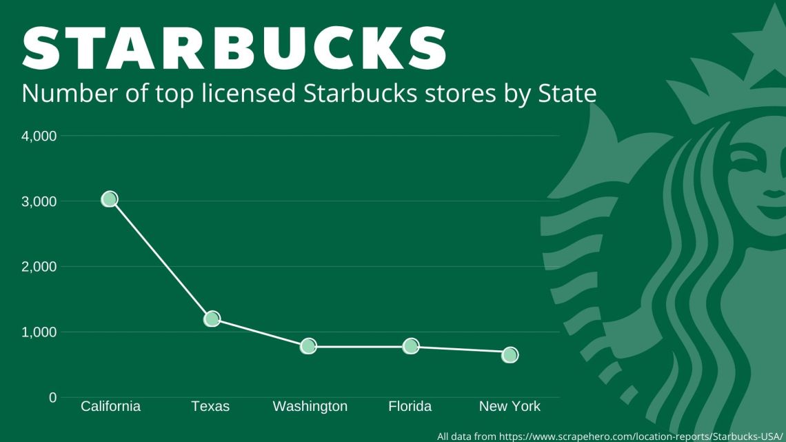
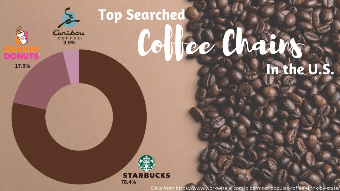
This week I decided to switch things up a bit and use different data to create my charts/graphs. Although I liked my topic last week (social media), I wanted to focus on a huge debate: Starbucks or Dunkin? I focused more on Starbucks because that’s what we have at Bloomsburg, but I wanted to make sure to include the wonderful Dunkin’ as well. I found my information on two different websites that I included at the bottom of each chart. I then decided my color schemes for each visual. Since the first one focuses on Starbucks, I looked up the actual Starbucks color code online to be able to make sure I had the right shade of green behind the information. I then found a cute background photo with coffee beans to use for the second one to tie in the different coffee shops I focused on. I then decided to switch up my charts from last week and did a line graph and a “donut” pie chart. I think they turned out really well and I am content with the designs I came up with. I found it very interesting that Starbucks ranked over Dunkin because the debates I hear all over our campus specifically is that Dunkin is the best, however those in California and New York think differently.
