
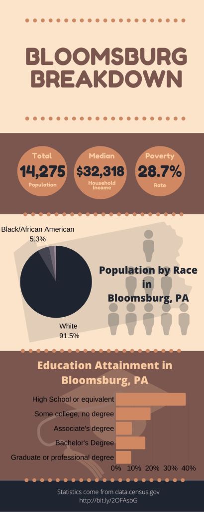
To create this graphic, I used the program Canva. I chose a template to give me an idea on how to space out the information but changed the fonts, colors, pictures and even the layout to my liking. I didn’t know what topic to make my graphs around but after looking through the resources, I decided I wanted to take a closer look at who makes up the town of Bloomsburg. In total, this project took me a little over an hour after I decided on the topic and information I wanted to include. Once I had a topic and a layout, I began to input the data and charts and change the color scheme around. I always get the codes for my colors by searching up color schemes on Pinterest.
