
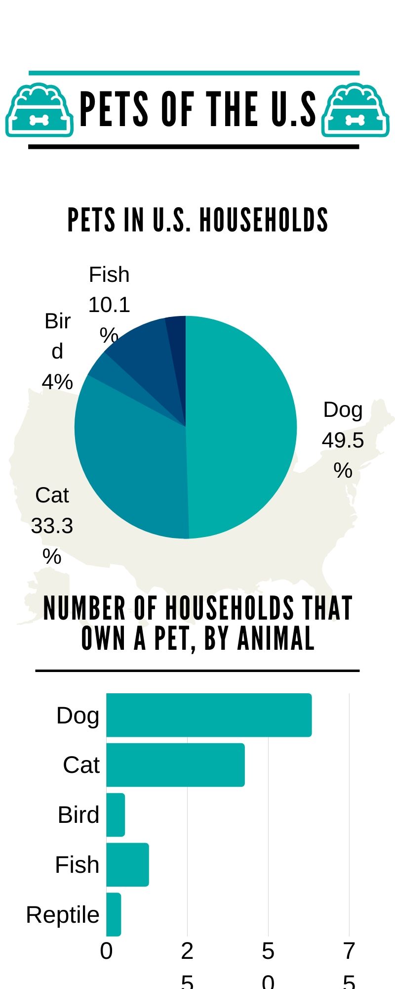
To create this infographic, I used a template Canva.com. I basically transformed this template into my own by changing the colors but I took a little bit of their design techniques. The template I used had a background with countries which is where I got the idea to put U.S in the background. I chose this topic because I had never thought of how many pets are in a household or how many households own a pet so I thought it might be interesting to do and not a topic that is done very much. I got my information from this website. It took me about an hour to get the research information and then to make the graph and chart, then to add them up and divide to get the percentages.
