
By: Rachel Iredale
Reflection
Program:
I chose to use powerpoint since I have the most experience with this application and this is the first all inclusive infographic we have done. I started from scratch and crafted each element myself. I like that I have become more comfortable using this program. I do not like that this looks like a word document. Some infographics I have seen are very intricate and visually pleasing. Using power point to create my infographic makes it look like a word document.
Research:
Before researching, I had to choose a topic. I knew I wanted to do money and health care since I will be going into the health care field. I decided to incorporate different countries to see how the united states compares. I spent a lot of time researching this topic. I had to go to multiple different trusted websites in order to get all of the information that I needed. Overall, I spend around 1 hour researching this topic.
Creating the Infographic:
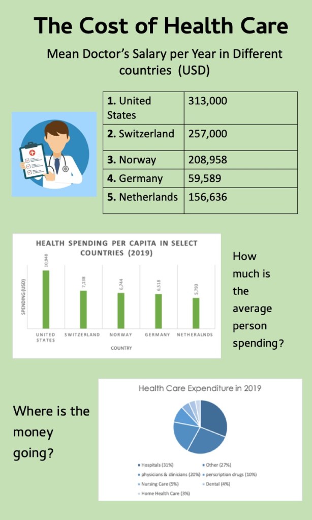
I knew that I wanted the background to be green because this weeks topic is all about money. I decided to add the Doctors salary in as a table because it helps the information to look organized. I added the cartoon picture of the doctor to help give the audience a visual. I utilized a bar graph to show how much money per year a citizen in different country spends on health care. I also used a pie graph to break down what exactly health care costs are spent on. I also used text boxes to help give a heading to the graphs and tables.
