
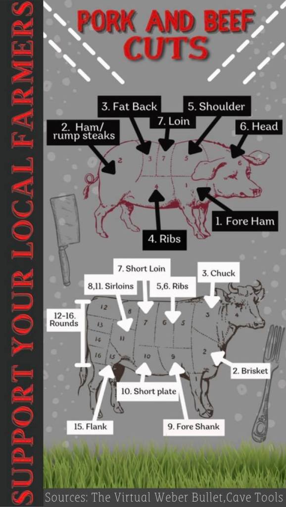
To create this infographic I used Canva. I designed it from scratch. I love using Canva because its easy and allows me to be very creative. I researched this topic by finding sources that had an image related to the outline image Canva gave me and labeled the parts the based on other images I saw on the proper cuts. I researched the topic as I created the infographic, altogether it took me 2 and a half hours to create this diagram. My design process was to find a font that kinda fit the theme and looked appropriate, then I added the dashed lines to the side since its about cuts. I them wanted a bland background that wasn’t distracting and helped the boxes under the labels stand out. I decided to change the color of the pig to pig and the cow to a brown so it sticks out a bit more. The grass at the bottom seems to be a good touch since we were discussing animals. I also find it important to add the “Support your farmers” to the side because that is were our meats come from, reminds people to support the small/ local farms that work very hard raising animals and growing crops and whatnot. I added the transparent bubbles for some design to draw in the viewers attention. Overall I enjoyed creating this infographic.
