
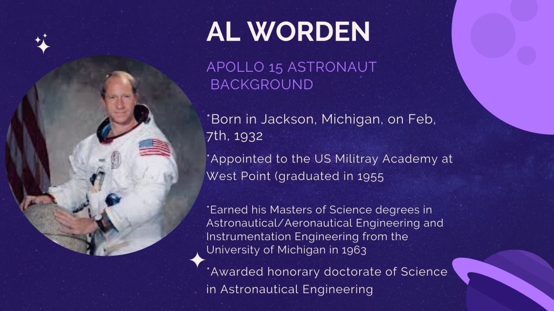
 This infographic would go before the 1st paragraph. This falls under this one as I feel like it is nice for the reader to have some basic background on Al Worden before reading the story about his life as an Astronaut.
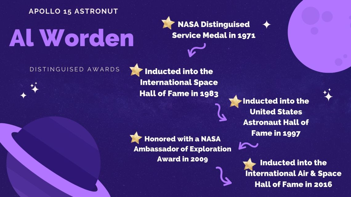 This infographic would go after the 3rd paragraph. This goes under this paragraph to help the reader understand why his achievements in space and earth will not go forgotten. This helps the readers know some of his achievements.
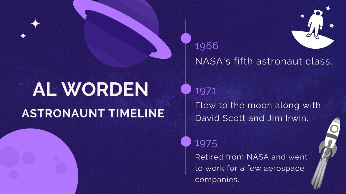 This infographic fall under the 9th paragraph. This falls under this paragraph to help the reader see in a timeline form Al Worden’s history with NASA and being an Astronaut.
Overall, this assignment was quite confusing and challenging! For starters I really didn’t find many areas of the story to be confusing or statistical heavy. I spent a lot of times reading through the article to try and figure out what paragraph could be enhanced by a infographic. The easiest infographic that stuck out was the one under paragraph 3. They mention that he had a lot of achievements in his life but don’t list them so I did research and found out this information on https://www.universetoday.com/145467/apollo-15-astronaut-al-worden-has-passed-away/. The next one that came to mind was the timeline of his career. I decided to make this visually shown to help the readers see the year he was with NASA and when he left. Lastly, the infographic that opens up the story came to mind after reading the story a few times. I felt like I was missing his education and birth background to understand him as a whole. I found this information on https://www.nasa.gov/feature/nasa-remembers-apollo-15-astronaut-al-worden/.
I used canva to complete my infographics this week. I decided to start with a template so that I can keep my 3 infographics very similar so that it shows that they all fit under the same story. I also really like the graphics available to me by using this template. The colors choice was apart of the template but I really liked it as I feel like it was fitting to a space theme. I added a few extra graphics throughout the three and adjusted the font size and formatting to make sure it was visually appealing and the information I wanted fit. Finding my information to add to the story I made the infographics on was not challenging, all I had to do was search his name and the needed websites showed up. Since he is a well known figure he was written about by a bunch of websites, especially when he passed away. Overall, the design process wasn’t challenging as I am familiar with Canva but figuring out what to focus my infographics on was very hard and took me way longer then it should have.
