
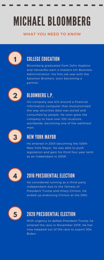
For my first infographic, I decided to place it underneath paragraph 4. This way the reader can get a full grasp on who Bloomberg is and where he earned all of his money.
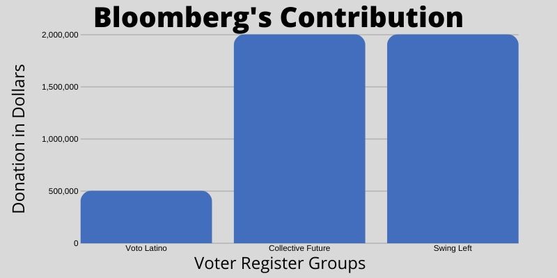
I decided to place this graph in-between paragraph 12 and 13 so people can see just how significant these numbers are.
With my last graph, I decided to place it between paragraphs 14 and 15. When reading this, I was not well informed on the DNC and GOP so I decided to include figures from 2020.

For this assignment, I decided to use canva because I am super comfortable with it. For the first image, I used a template, for the two graphs I made them from scratch. I never knew you could create your own dimensions with this program which was really helpful for this assignment. What caught my attention most with this story was how much money was being discussed. It was truly mind blowing researching this guy. I thought that the representations of these large numbers would be really beneficial as well as a short biography describing Bloomberg’s life. I researched this topic using a biography website and a DNC vs RNC website. All in all, it took me about 4 hours to complete this assignment including research and creation. My design process was all about choosing which data to represent and how to display it. Since he is a democrat, I chose to use a blue color way.
