
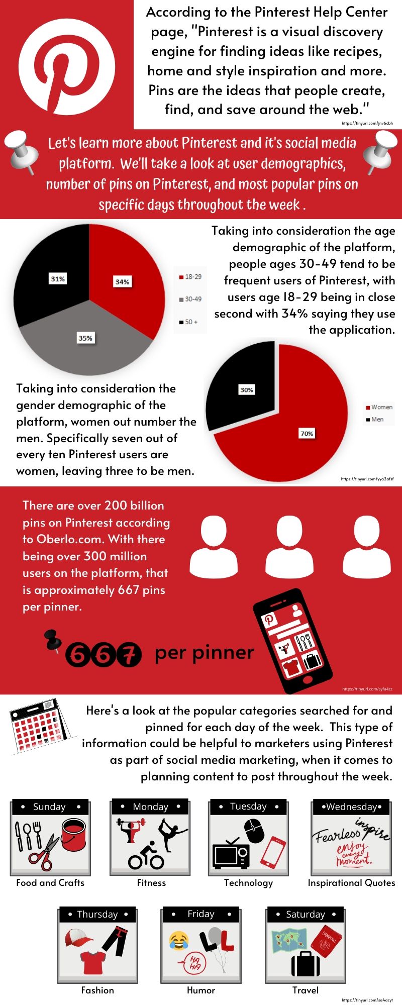
This week I decided to create my Media and Entertainment infographic on Pinterest. I included a basic understanding of the social media platform and foreshadowed what would be seen throughout the rest of the infographic. I added information regarding gender and age demographics of users of the social media platform, the number of pins approximately on Pinterest, as well as specific popular categories corresponding with each day of the week. The audience for this infographic would be people who are interested in learning more about Pinterest and who may not be on the social media platform yet but are thinking about joining. I would say it took me about two hours to do research and decide what information to include on this week’s infographic.
I created my infographic on Canva and made it from scratch. I created both my pie charts on Excel and transferred them onto the infographic in Canva. I decided to use the colors red, black, and grey for the graphs to keep the colors related to the applications brand colors and with being put against a white background for the section they were in. I alternated the red and white Pinterest brand colors as backgrounds throughout the infographic to divide the different topic sections. I made the three main colors of the overall infographic red, white, and black as well. Throughout the infographic I used little pin icons to go with the theme of Pinterest and to accent the number of pins on the application as well.
For the amount of pins section, I used a person’s profile icon to represent 100 million users on Pinterest, there being three different person profile icons to represent the approximate 300 million users on Pinterest. I then created a Pinterest profile on a phone icon to represent a pinner and then used numbers and a pin icon to describe how there are approximately 667 pins per pinner. I also thought that it would be really interesting to make a diagram using calendar icons for the days of the week section and using icons to describe more about each popular category for the days. Overall it took me about 4 hours to complete the creation part of the infographic. The numerous icons that I used throughout took the longest time to figure out which ones to use, choosing the colors, and overlaying/positioning the icons properly and grouping them together to move around.
Information Sources:
All about Pinterest. (2020). Retrieved from https://help.pinterest.com/en/guide/all-about-pinterest
Lin, Y. (2020, March 25). 10 Pinterest Statistics Every Marketer Should Know in 2020 [Infographic]. Retrieved from https://www.oberlo.com/blog/pinterest-statistics
Perrin, A., & Anderson, M. (2019, April 10). Share of U.S. adults using social media, including Facebook, is mostly unchanged since 2018. Retrieved from https://www.pewresearch.org/fact-tank/2019/04/10/share-of-u-s-adults-using-social-media-including-facebook-is-mostly-unchanged-since-2018/
Southern, M. (2014, May 16). Pinterest Reveals The Most Popular Categories On Each Day Of The Week. Retrieved from https://www.searchenginejournal.com/pinterest-reveals-popular-categories-day-week/105903/#close
