
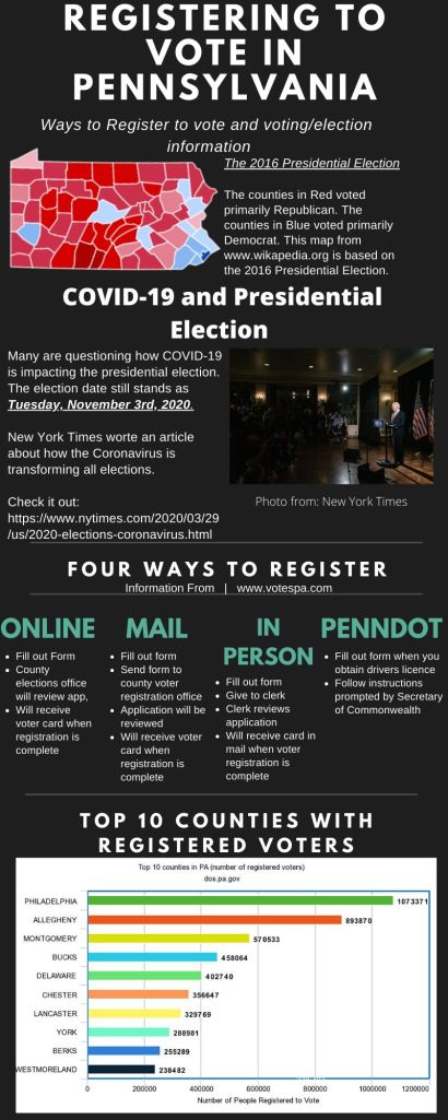
Creating this infographic, I kept in mind what is happening in the world. I chose to show the counties who were primarily Republican and Democrat in the 2016 Presidential Election. I then moved to showing an article from New York Times, to discuss how the COVID-19 pandemic is affecting the 2020 Presidential Election. I moved on to discussing how to register to vote. Lastly, I showcased the Top 10 PA counties that are registered to vote already.
The design process was very easy because I used Canva and Meta-graph. I chose colors that were more neutral for the graphs and pictures to show up. It took me quite some time to research the topic. I wanted to get information that was reputable and explained each topic. I found the sites and resources I used easy to navigate.
