
The program I used to create this infographic is Canva. I started from scratch and used a pre-made chart and pie graph to enter my information in. Something I dislike about Canva is that sometimes my text doesn’t fit and goes off the image, or the percentage isn’t next to the number. Also, the infographic sizes they give don’t seem to be that big because it’s difficult to fit both graphs and charts on it.
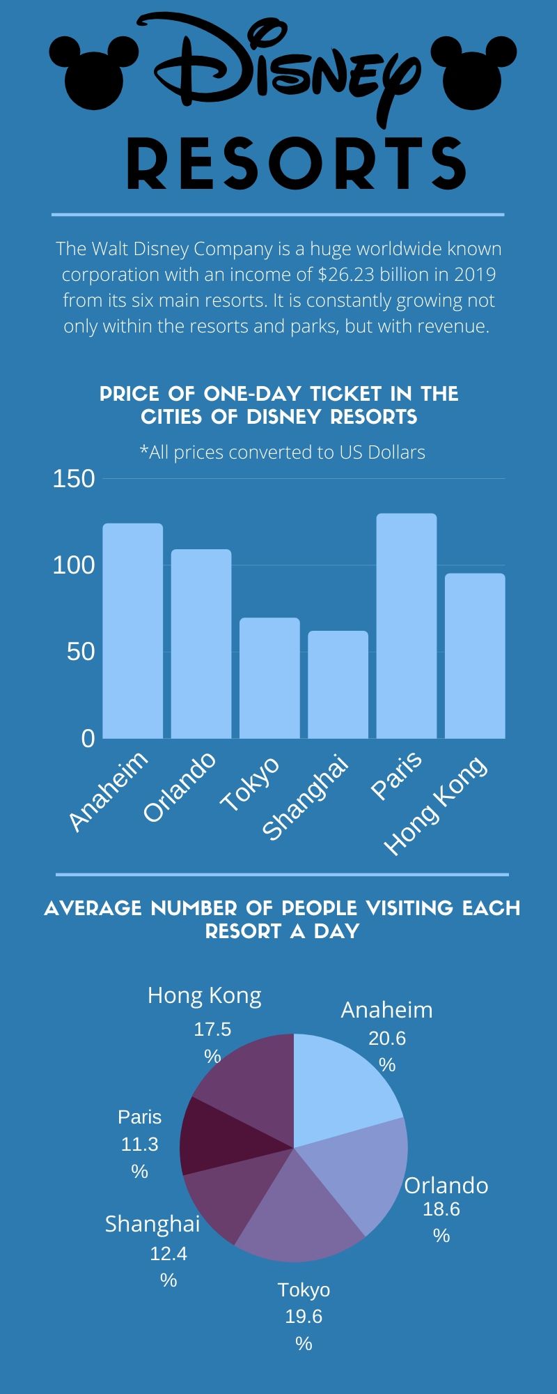
I researched my project by going on all the different Disney websites corresponding to the city they are in to find out the ticket prices. The websites are linked for Tokyo, Shanghai, Anaheim, Orlando, Paris, Hong Kong. For the Walt Disney Company revenue of 2019, I found it on this website. To find out how many people visit the resorts daily, I found it through this website. I added up all the numbers from each resort then divided each number by the total number to find out the corresponding numbers for each resort.
To complete this infographic, it took me about 2 hours. 1 hour researching, then coming back and designing and figuring out how I wanted to display the information.
I chose colors that match Disney, which to me is a bluish tone. I would have liked to add more elements to make it less boring but with Canva a lot of things are locked to pay for.
