
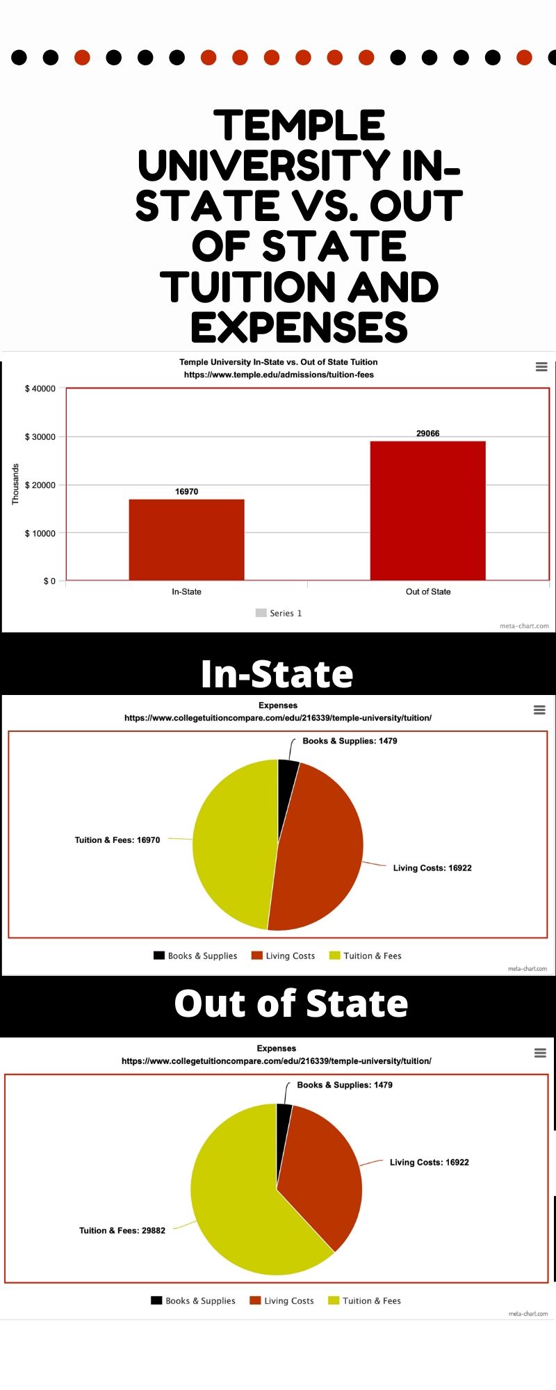
For this infographic I got inspiration from my classmates. Two people did Bloomsburg’s tuition and expenses comparison so I chose Temple University. I chose this topic because 5 of my friends attend this institution and I was curious as to what they pay. I gathered my information from two different websites. I also used mega chart and canvas to complete my infographic. For the most part I tried to stick with Temple’s colors, although when it got to the pie charts that became more difficult. The only thing that bothers me within this chart is that I was not able to include the dollar signs or commas to differentiate the prices.
Sources:
https://www.collegetuitioncompare.com/edu/216339/temple-university/tuition
