
For this info graphic I wanted to do something other than tuition fees and domestic graphics. I wanted to look at another country, in this case China. But this one is not about the coronavirus; its about their economy and trade.
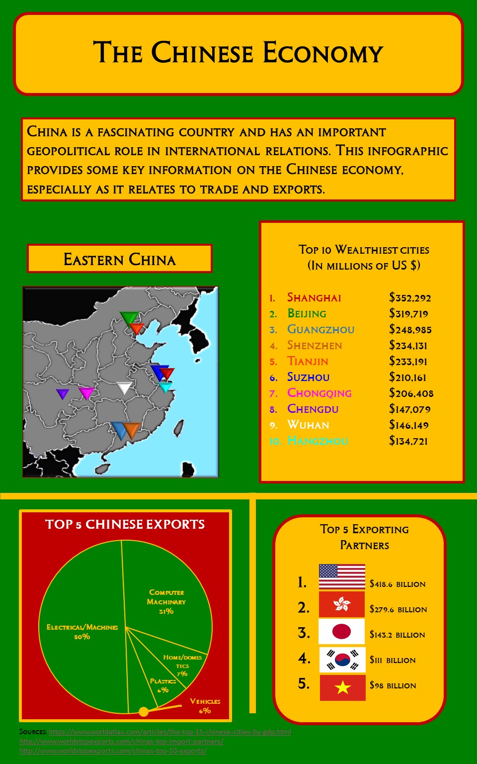
First I started with looking at the top 10 wealthiest cities in China. Once I discovered all of them are in the eastern part, especially on the coastlines, I cropped the west out because it was taking up too much space and wasn’t necessary. I also modified the colors on the map, although I wish I spent more time changing them. I made a list of the top ten cities and the and the millions of US dollars they make on average (taken in the year 2013). I then color coded the cities so viewers can know which city is where on the map, which is especially useful for foreign cities.
Then I looked into top exports, and took the top five out of the top ten for space and attention reasons. I messed around with the colors and chart’s composition for several hours to get it to look its best but I’m afraid I didn’t account for viewing when considered character size. I kept zooming in an out of the document, so the size of some info might be too small.
Finally, I created a top five list for China’s exporting partners. I started with flags, and then realized I needed the numbers to for it to say something. The maps help quickly visualize the top trading partners, but I now realize I should have given captions for some. For reference, 2 is Hong Kong and 5 is Vietnam.
