
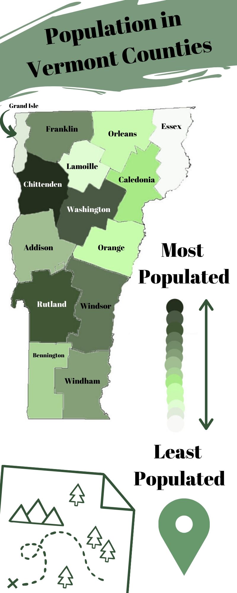
For this week’s Infographic I created a map that shows the most populated Vermont counties to the least populated. I used Photoshop first to fill in each county and then I imported it into Canva to add design and words. It was more challenging than other weeks because I didn’t use a template I did it with my own design. I used greens because it is the Green Mountain state. The research didn’t take too long, I got the info from Vermont Demographics. It took longer to decide what I wanted to make. It took me about an hour and a half to create it all together.
