

#world #obesity #UnitedStates #highrates #lowrates
The program I used to create these charts was excel. I find it easier to plug in all the data and then search for suggested charts to give me the best possible option for the data I need to be using. I like this feature because I pick a design that works the best. I also really liked being able to plug in my data first. It sometimes can be hard to use with getting the data to the table which is what I am not a fan of.
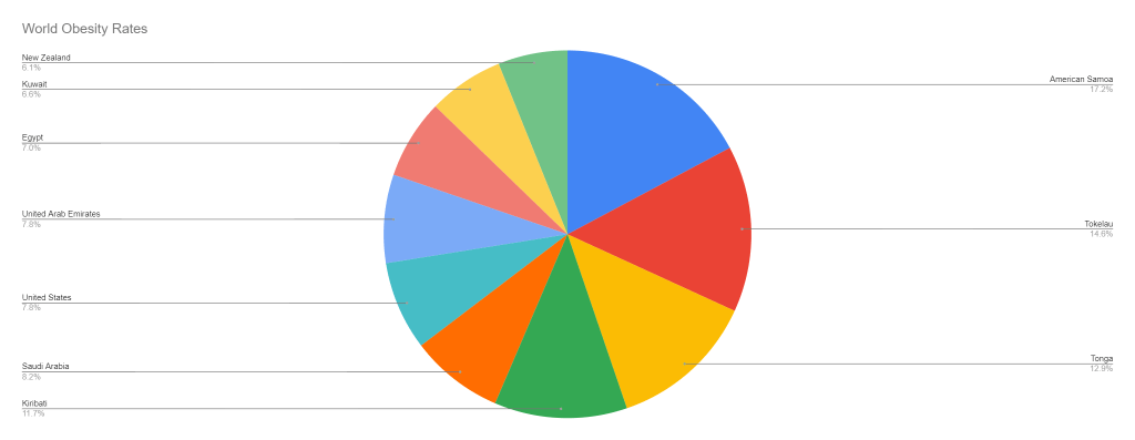
I used the CIA website to research this topic because I know it is a reputable government site that would not be supplying faulty information. It only took me around 5 minutes to research the topic because I just searched the highest obesity rates within the world and it supplied me a chart with the data.
The design process was simple. I kept it easier for myself because I was having abit of a struggle to get all the information on the graph. Once I did that, it flowed a lot nicer than what I anticipated. I made sure to label each of the axis and then I just left the colors as the default because they were fine with me. I feel it was still easy to follow and understand.
